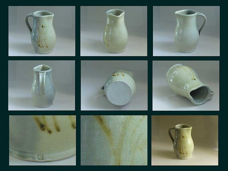
Pitcher - brushstroke design, "J" in square mark
Page 1 of 1
 Pitcher - brushstroke design, "J" in square mark
Good day to everybody! I am new in this forum, and I am in hope if anybody could help me out to identify the markings on pottery. I don't have much knowledge in professional terminology in ceramic genre, and will try my best to describe the items in my own words. Please, correct me, if I mistaken on something, and sorry in advance for my mistakes.
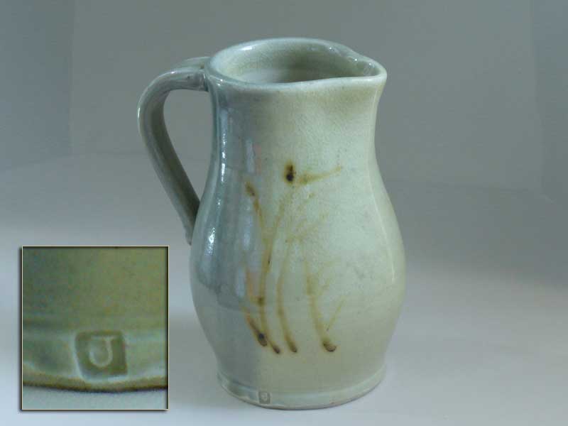
Pitcher with brushstroke design.
Measurements:
Height - 8 3/8"
Bottom stand diameter - 4 1/4"
Approx. diameter in widest part of the body - 5 3/4"
Top view (opening) - 4 3/4" x 3 3/4"
Handle attachment point (height from the bottom stand) - 3 1/4"
Clay:
White color (unglazed bottom stand)
Glaze:
Glossy and it has gradient from light yellowish beige (3/4 of the body) to very light bluish teal (1/4 of the body). Glaze has crazing. Glaze is outside and inside the pitcher, bottom is unglazed.
The brushstroke design located on the border of gradient, starting on light bluish teal color and expanding to light yellowish beige part.
On the light bluish teal part there is a richer color "smudge" from the top of a pitcher, looks like a wide drip (giving sense like water overflowing).
Brushstroke design (in my interpretation for my eye) - looks like cat tales slightly bending in the wind. The coloration is uneven - from very light touch of brown to dark, and rather blurry than defined.
Marking:
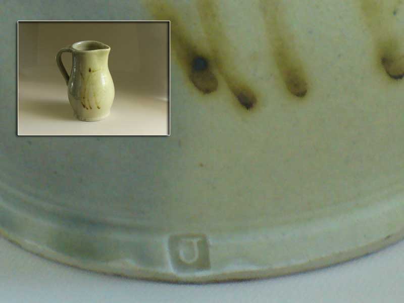
Incised stamp - square with raised letter "J" in it, glazed.
Located on the bottom part of the body on the border of gradient under the brushstroke design.
Other details:
a) on the lower part of handle attachment there is a diagonal cut about 1/4 of an inch on the left side from the handle, and small "dimple" on the left. For my eye it looks like marking from the potter in the process of creation, as to where the handle attachment should be.
b) on the opposite side of the pitcher from the stamp marking there is also something that looks like half of a circle under the glaze, almost like a very tip of fingerprint pressed from very bottom up. It has lighter color than the glaze around it and very slightly leveled in. No letters or anything else in it. (Just discovered, if photo needed, will post it upon request). Size is 1/2" x 1/4".
History:
Not much to say here. I picked up this pitcher in an estate sale about 8-9 years ago. Some time ago I was doing ebay auctions and was attending different estate sales. In a couple of years I accumulated small collection of pottery, glass and some antiques for myself, trying to learn brief history and brief biographies throughout those items. As I learned, later on I would sell the items, but some of them I was never able to decipher for myself. My choices for picking up items from estate sales mostly were intuitive and run through appreciation for originality and beauty. Now I feel like it is about time to let my collection go, but my brain is screaming for answers, and I am so glad to join this platform in hope of help.
My research:
Also not much to say. I run through some auctions, a couple of marking identification sites, did image search, no luck. The most similarity in design for my eye were some works of an artist - Jim Malone, but his marking (what is available on internet for a public view) is different.
Will appreciate, if anybody will share thoughts. Thank you.


Yelena- Number of posts : 42
Location : USA
Registration date : 2021-11-16
Page 1 of 1
Permissions in this forum:
You cannot reply to topics in this forum